Lizee · 2023
Rebuilding a homepage around real user needs
Rebuilding Lizee’s RMS homepage around real needs: user research, ideation workshops (How Might We, Crazy 8) and a role-aware dashboard, from wireframe to HiFi prototype.
Context
After surveys, user feedback and session analysis, Lizee’s product team found that the RMS homepage (the circular-logistics SaaS) was barely used: operators went through the side menu they knew, and managers preferred the dedicated analytics pages.
At the same time, Lizee was extending its SaaS from the warehouse to the store for an omnichannel solution. New profiles, in-store sellers who are pressed for time and lightly trained, had to pick up the tool for rentals and second-hand buy-backs, on desktop and on mobile.
Understanding the problem
Four questions framed the work:
- What problem? An unused homepage, a tool that felt complex, and hard access to key information.
- Why? Simplify the RMS experience and make people want to explore its features, whoever the visitor is.
- For whom? Every profile: prospect, operator, in-store seller, decision-maker, brand project lead.
- Jobs to be done? An overview of the rental and second-hand steps, a view of the key indicators (without duplicating analytics), priority-task management, and an interface contextualised by role, environment (store or warehouse) and model (rental or second-hand).
Ideation workshops
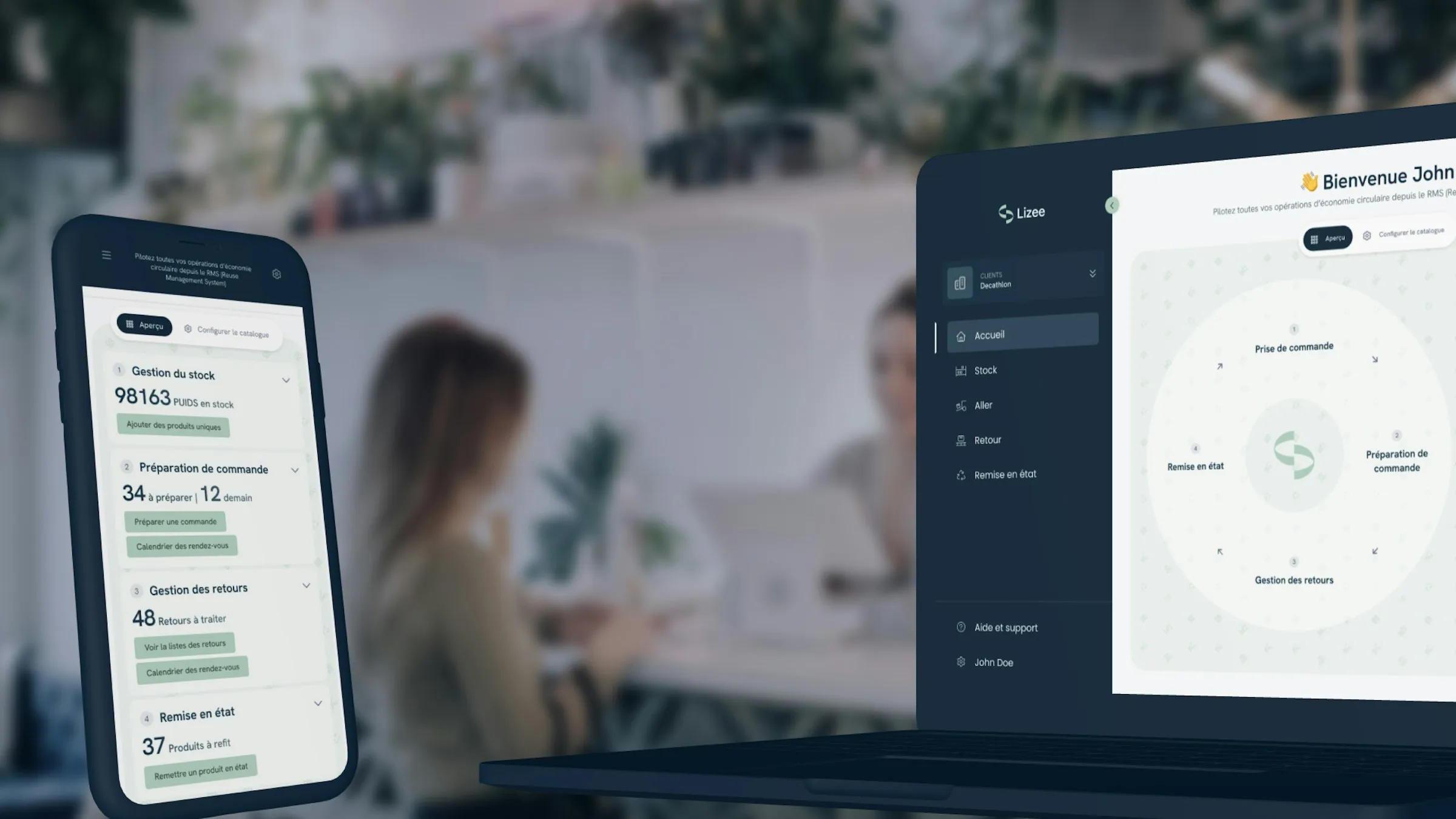
A How Might We confirmed that data had to be contextualised by role and model, and that each operation had to be made understandable through a playful interface, given how much the level of knowledge varies. A Crazy 8 surfaced the loop shape, the truest representation of the circular economy: putting retail items back on the market through rental and second-hand.
Solution and prioritisation
User interviews showed that in-store sellers and managers struggled most to find what they needed from the homepage, while warehouse teams were already comfortable. The solution therefore targets store newcomers: a role-personalised view, operational and instructive for the seller, statistical for the manager, and adaptable afterwards to warehouse roles.
From wireframe to HiFi prototype
After several passes in Figma mixing sketch and HD wireframe, user tests were conclusive: the intended simplicity came through naturally in testers’ words. The design system provided most of the components, enabling a fresh round of desktop and mobile tests for each role.
Measuring success
To gauge success, several indicators were set: usage statistics (via June), the number of round-trips between the homepage and its features, click tracking on the CTAs, time spent on the page, overall daily session time, and a drop in RMS-related support tickets.